Living with sculpture in the room you sit in
October 2026 · The Venustare Curation Desk · 4 min read
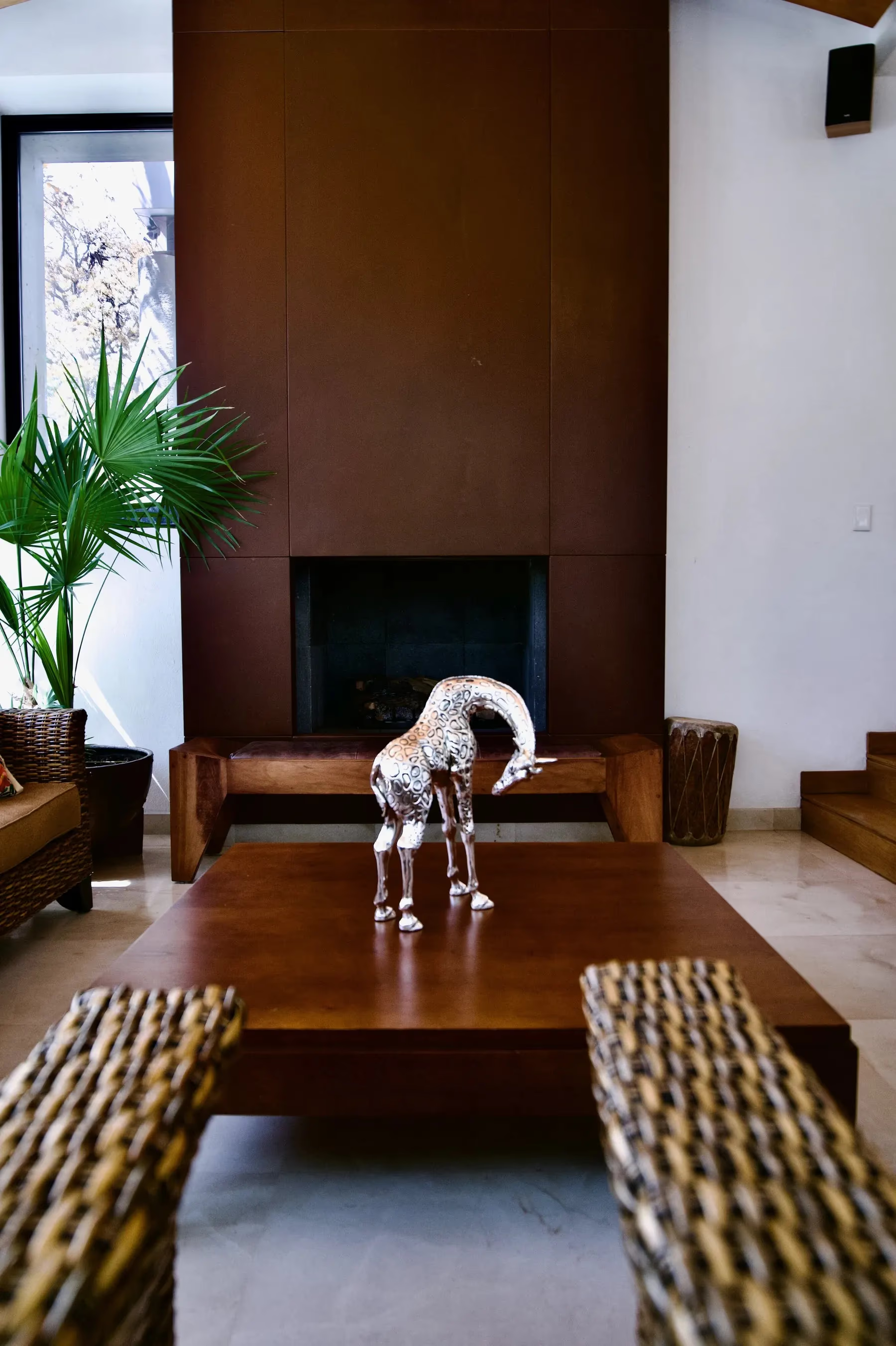
A bowed figure gives the eye a path to follow instead of a block to stop at.
Much living room sculpture disappoints because it was chosen as if for a gallery plinth, and then placed on a coffee table. A low table is looked down on, from a sofa or from across the room, so the form has to hold up from above as well as from the side. A piece that only works in strict profile turns flat and confusing when you are sitting beside it. We look for objects that keep a clear outline from both views, whether you are standing in the doorway or settled into a chair with a book.
A fireplace is a dark rectangle, and dark rectangles are generous to metal. Set a pale silver figure in front of one and the contrast is immediate: the shadow behind pushes the piece forward and makes the finish seem to glow, with no lamp aimed at it. This matters most for low placements, where the light is softer and more scattered than on a lit shelf. Even when the fire is out, the hearth does the work of a backdrop, and a single bright form in front of it reads clearly from across the room.
Movement in the form helps. Take a bowed figure such as the Silver Giraffe Statue Head Down Mother. The long downward curve of the neck gives the eye a path to follow, from the shoulders to the lowered head, instead of a block to stop at. In a living room, where attention keeps shifting between conversation, a book and the fire, that line gives the composition a quiet sense of motion. A figure that bends, turns or reaches will always hold a low surface better than one that simply stands.

This is also a room where people sit, eat and put their feet up, so plan for it. A sculpture on a coffee table is not behind glass; it is part of daily traffic. Think about where drinks land and where elbows rest, and keep the table nearly empty around the piece. That empty surface is not only a matter of taste. It is a working buffer that protects the object, and it lets the form breathe. A tray of remotes beside a fine figure makes both look like clutter.
The surface underneath changes how the metal reads. Warm wood softens the cool of silver and makes the pairing feel relaxed and lived in. Polished stone does the opposite: it reflects the piece back, adding shine and a second, fainter image of the form. Neither is better, but they suit different rooms. Look at the palette and the light you already have, and choose the placement where the finish and the surface flatter each other rather than compete.
Before you buy, measure the table you will actually use. Note its width and depth, then take away the space that cups, plates and books will claim on an ordinary evening. What remains is the footprint the piece can have while still reading as the center of the table. Check the sightlines from the sofa and from the doorway, and from standing height as well as seated. If the figure would feel crowded on paper, it will feel crowded in the room. Leave generous margins, and the piece will stay the point of the room rather than an obstacle in it.


Further Reading
More from the Journal
October 2026
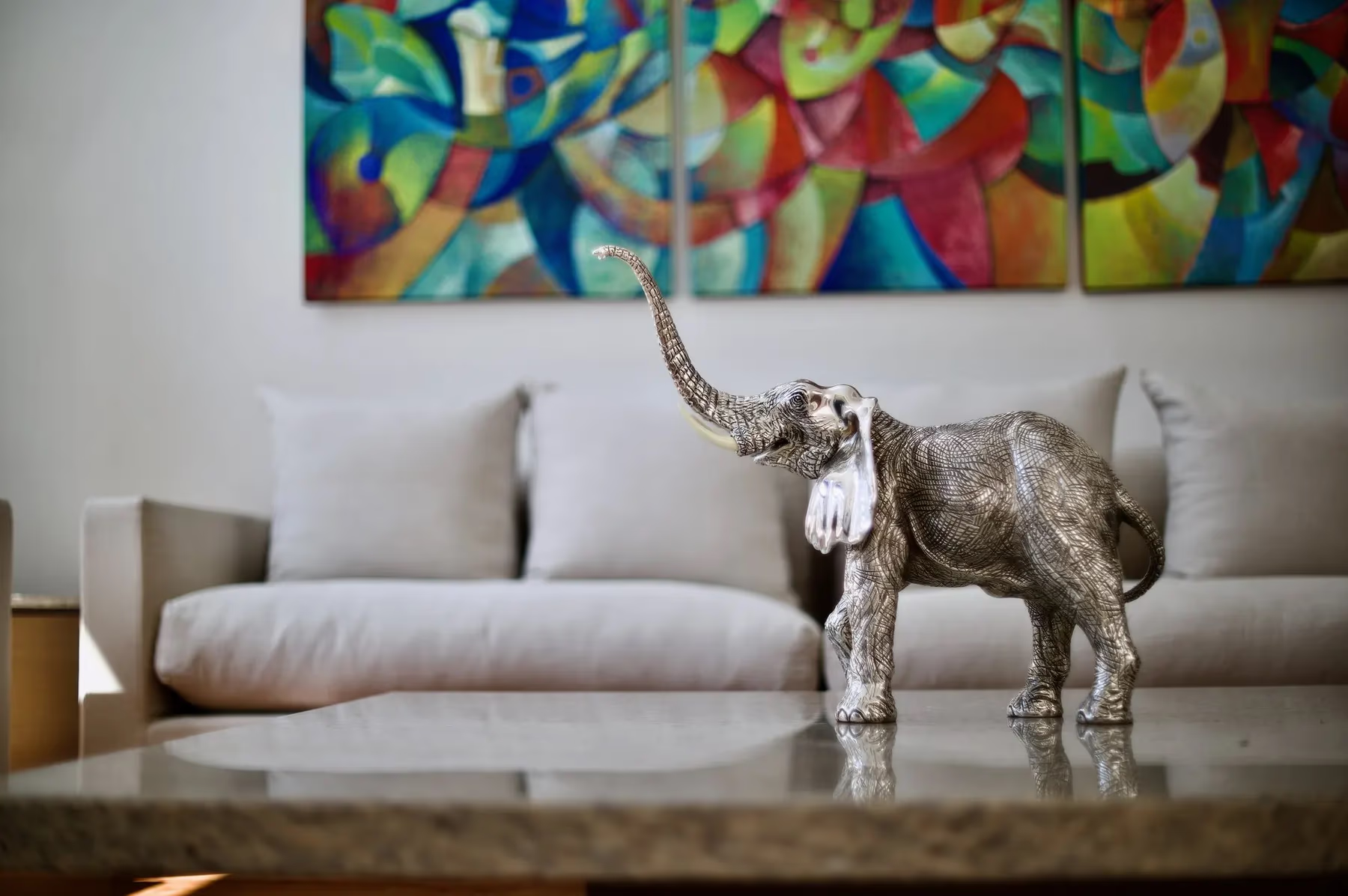
Silver against a bright painting
When a saturated canvas already holds the room, silver is the neutral that rests the eye. On contrast, reflection, scale, and the gesture that links the two.
July 2026
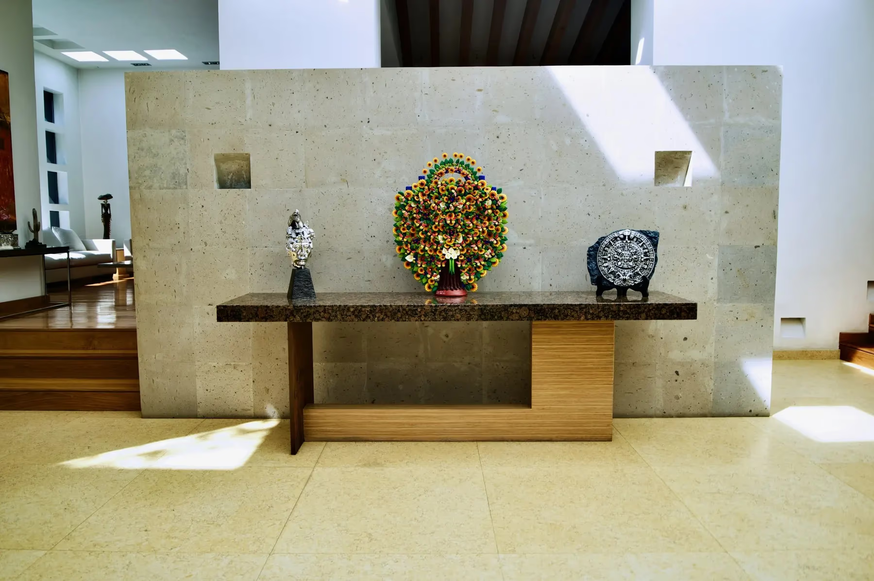
Styling a console with one serious piece
The rule professional stylists swear by: one object with presence beats five without it. A working guide to scale, finish, and negative space.